Layout structure
Grid
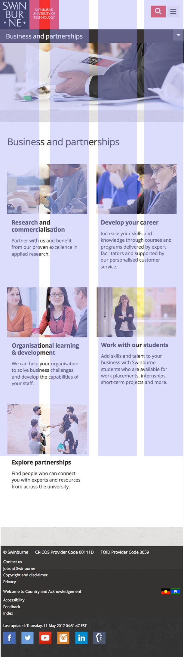
The site is structured around a 12 column, fluid grid with a fixed width left column. At the smaller breakpoints the site drops to an 8 then a 4 column layout and removes the fixed width first column.
The grid is created using Susy grids (http://susydocs.oddbird.net/en/latest/) and settings for the grid can be found in sass/partials/_config.scss
The site will be a maximum width of 1325px which includes 12px gutters either side as padding.
The three defined grids are(mobile first):
- Mobile - 4 columns @136px, 24px gutters
- Mobile large - 8 columns @ 104px, 24px gutters
- Desktop - 12 columns @ 76px, 24px gutters
Mobile Grid
Mobile large Grid

Desktop Grid

The HTML that defines the grid is as follows:
Grab Code
There is also a .container--full class that will make the grid span the full width, including the fixed width section. This is used in areas like the header and footer.
Using the Susy grid system
Susy is a powerful grid system and allows you to easily layout elements semantically. All the main layout templates are already defined in _layout.scss but laying out other blocks is quite simple. I will give an overview of how the grid system works but for more in depth information, consult the documentation (http://susydocs.oddbird.net/en/latest/) or there is also some very useful information here (http://www.zell-weekeat.com/tag/susy/).
Spanning columns
Susy has two methods for spanning columns, a mixin or a function. The most basic is the mixin. If you wanted to span 6 of the 12 columns in the grid you write:
            .my-block {
              @include span(6 of 12);
            }
This will output as CSS:
            .my-block {
              width: 49.24242%;
              float: left;
              margin-right: 1.51515%;
            }
There are also settings you can add to the mixin, like the keyword 'last' which will remove the right margin and float right. E.g.
            .my-block {
              @include span(last 6 of 12);
            }
If you want more control you can use the function:
            .my-block {
              width: span(6 of 12);
              float: left;
              margin-right: gutter();
            }
Or if you wanted a block that spans 6 columns but instead of adding a right gutter, add the gutter width to the block width, you can do:
            .my-block {
              width: span(6 of 12) + gutter();
              float: left;
            }
Helper classes
Some helper classes have been created to quickly layout a section based on the 12 column grid. These should not be relied upon but can be handy to use when wanting to structure some content.
The classes start with
.l-span-[1-12]For a two column content block you can use
            <div class="row">
              <div class="l-span-6">
                <!-- First column content -->
              </div>

              <div class="l-span-6 l-span-last">
                <!-- Second column content -->
              </div>
            </div>
The .l-span-last {} class removes margins on the last element. The l-span classes must be wrapped in a .row to clear the floats.
Responsive breakpoints
The grid is re-defined at set breakpoints with other media queries tweaking the content around those breakpoints.
As with other settings in the site, the breakpoints are defined in the _config.scss partial.
These defined breakpoints are(mobile up):
- Breakpoint 1 (mobile - 20em (320px equivalent)
- Breakpoint 2 (mobile-large) - 40em (640px equivalent)
- Breakpoint 3 (tablet-small) - 47.5em (760px equivalent)
- Breakpoint 4 (tablet) - 70em (1120px equivalent)
- Breakpoint 5 (desktop) - 80em (1280px equivalent)
- Breakpoint 6 (desktop-large) - 90em (1440px equivalent)
A mixin is used to declare these breakpoints in the scss. This names the breakpoints to something more useful and also enables a fallback for browsers that don't support media queries
Example usage of the breakpoint mixin:
            @include bp(mobile-large) {
              @include layout($mobile-large-grid);
            }
This defines the use of the mobile large grid at the mobile-large breakpoint.
The bp mixin can also be nested inside selectors, again they should be defined from mobile up. For example:
            .nav {
              // mobile first styles
              display: block;

              // mobile large styles
              @include bp(mobile-large) {
                display: inline-block;
              }

              // tablet styles
              @include bp(tablet) {
                display: table-cell;
              }
            }
As the site is mobile first, the bp mixin will define all breakpoints with a min-width. To define a breakpoint for a max-width you can pass the 'max' parameter to the mixin. For example:
            .nav {
              @include bp(mobile-large, max) {
                li {
                  display: block;
                }
              }
            }
The mixin does not support min to max ranges. If you need to do this then you should use the standard media query. E.g.
@media only screen and (min-width: 320px) and (max-width: 600px){ //styles }Modular blocks
The site is built with re-usability in mind. Most of the blocks used have been built to be self-contained modules that can be used in any context. Modifier classes are used to change the base structure.
A modified version of BEM syntax is used to create this. BEM stands for Block, Element, Modifier. and an example of this is:
          <div class="panel">
           <header class="panel__hd">
             <h3 class="panel__heading">Heading</h3>
           </header>

           <div class="panel__bd">
              <!-- body content -->
           </div>
          </div>
The block level class is '.block', child elements are '.block__child' and modifiers are '.block--modifier'. The panel block can have modifiers attached to change the style. The panel block currently has some colour variations like:
          .panel--invert  { background: $swinburnebeige; }
          .panel--blue    { border-color: $swinburneblue; }
          .panel--black   { background: $swinburneblack; }
          .panel--grey    { border-color: $swinburnegrey; }
          .panel--green   { border-color: $swinburnegreen; }
          .panel--teal    { border-color: $swinburneteal; }
Code structure
As mentioned the syntax for creating modules uses a modified BEM structure. You can read more about that here: http://csswizardry.com/2013/01/mindbemding-getting-your-head-round-bem-syntax/
Also in the root of the repository there is an .editorconfig file that sets up the project to have the correct spacing. You can find out more about Editor Config and whether your editor supports it here: http://editorconfig.org/
SCSS formatting
The site has been set-up to use the following formatting for scss files:
          // Multiline SCSS
          .class {
            property: value;
            @include rem(margin, 10px 10px 10px 10px);
            @include rem(padding-bottom, 10px);

            // Nested children, no more than 3 levels.
            ul {
              display: block;
            }

            li {
              display: inline-block;

              &:hover {

              }
            }

            @include bp(mobile-large) {
              // Breakpoints
            }
          }

          .single-declaration-css {
            property: value;
          }

          .include-bem-children {
            property: value;

            &__body {
              // Will output as .include-bem-children__body {}
            }
          }

          /* ==========================================================================
             Section comment
          ========================================================================== */

          /*
          * Module/block comment
          *
          * Explanation of what it is.
          *
          * .block-class-used {} .block-class-used--modifier {}
          *   .block__children {}
          *
          */

          // Minor sass comment
          // to explain what this bit of code is.
HTML classes stack to extend styles, e.g.
<a href="#" class="btn btn--primary btn--large">Stacked classes</a>
Icons
Icons use Font Awesome http://fontawesome.io/
To use the Font Awesome icons they can be placed in the HTML as so:
<a href="#">Link <span class="fa fa-angle-right fa-fw"></span></a>
Accessibility
The site adheres to WCAG A with the intention of aiming for AA compatibility. There are some helper mixins and classes to help keep an accessible structure while still retaining the required visual design.
For example if you want a form without labels, you still need to add the labels with associated 'for' attribute but you can use the .visually-hidden class to hide the labels but still keep them available for screen readers.
You can also use this as a mixin as so:
          .class {
            label {
              @include visuallyhidden();
            }
          }
Correct HTML structure needs to be ensured to keep the site accessible and also how JavaScript interacts.