Nathan Nankervis
Stories for a brighter tomorrow | Creator
Swinburne Bachelor of Design (Communication Design) (Honours) graduate and emerging artist
Easily overlooked among the bright colours, bold lines and overwhelming jocularity of Nathan Nankervis’s graphic designs are the subtle nuances that inhabit his work. Take his reshaping of the familiar Nike brand name for one.

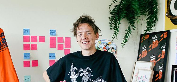
Artist Nathan Nankervis standing beside some of his work at Swinburne.
The A–Z of working with Nike
Created for the 2017 Australian Open tennis tournament where his designs were featured on the company’s T-shirts, Nathan’s Nike design drew on themes of youth and the rebels of the sport.
All the letters have his trademark ‘googly eyes’: stark white circles finished with intense black orbs. The letter N, with its odd purple clouds above a plain gold band, references a headband taming the curling locks of a young and feisty John McEnroe; while the waves falling off the letter E hint at the mullet hairstyle of a young Andre Agassi. The letter is graced with Agassi’s gold jewellery too. The letter K is comparatively simple; it is a player serving with its ‘googly eyes’ wide open in concentration.
There is more: the emerging young designer crafted an entire alphabet for Nike in which the design demarcations within letters include the lines of a tennis court obscured by blocks of colours and eccentric designs, while circles on straight lines hint at Hawk-Eye, the tennis line-checking technology.
"You need to justify to the brand managers why your design is good. It needs a story."
These are not tricks for the sake of conceit. “You need to justify to the brand managers why your design is good. It needs a story,” says Nathan. “So, it started off with the faces on the letters. Then I drew the lines of the tennis court through the letters and I added Hawk-Eye,” says Nathan. “The alphabet letters represent the facial expressions of the players and the fans watching. They’re also referencing the lines and the colours, the different cultures that follow the game and how people from different nationalities are brought together at the tennis.”
Developing a distinctive style
By his own admission, this Swinburne Bachelor of Design (Communications Design) honours graduate was not the most conscientious student. His attendance was sometimes patchy. He was often late to classes. He was reluctant to complete his honours year, but it came as a precondition for his time in industry placement. In hindsight, it was the smartest thing he could have done, as he recalls. “At the time, I was drawing my little characters and developing pop art aesthetics. It didn’t seem to fit in the honours stream, which was very conceptually based with lots of writing and reading, but on reflection it was pivotal.”
“It gave me a conceptual depth and the ability to explain why I am doing things. That’s what I learnt in that one year of honours. It was theory-based and it’s oozed into my work. Without it I wouldn’t be able to sell my work to Nike with all those googly eyes and colours.”
"Without completing the honours year I wouldn’t be able to sell my work to Nike with all those googly eyes and colours."
The denouement came one January morning when Nathan walked into a local shop to be confronted with a page one newspaper photograph of Roger Federer wearing one of his T-shirt designs. “It blew my mind. No-one had told me about it and it was like ‘Whoa!’ I bought four or five copies, one for my mum and one for my sister.” He admits that time was short-lived though. “It’s hard when you have these two weeks of feeling you’re a superstar and then it fizzles back down — but let’s get on with the show.”

Nathan at home in his studio.
For Nathan, the show has only been running a few years. He graduated from Swinburne in 2015, yet already he has a widely recognised personal style. His heroes are people such as the American graffiti and visual artist Keith Haring and the Brazilian modernist painter Tarsila do Amaral. Haring’s strong lines and Tarsila’s bold, contrasting colours and simple compositions are evident in Nathan’s work, but the playfulness, the childish aesthetic is his own.
His design world is anthropomorphic — here objects acquire eyes and a mouth, a character and an attitude. Give anything eyes and a mouth and anyone can relate to it, he maintains. Those characters appeared in his assigned work during his degree and over time he refined them, paring back to the simple lines he admired elsewhere.
Nathan’s clients so far have included the Dutch brewing company Heineken, the Australian clothing label Bonds and Red Bull drinks. His designs are starting to appear in novel places: his wallpaper design for the pan-Asian restaurant Kong in Church Street, Richmond, lines the eatery’s bathrooms.
Making the most of a year in industry
Swinburne gave Nathan his first insight into graphic design, which was unknown to him coming out of high school where he studied visual communications in his final year. At the university, he learned about branding and design, and possibly discipline, since he made a point of completing all his assignments to deadlines and keeping close to the briefs regardless of his sometimes lackadaisical approach to attendance.
Most importantly, he says, he was able to take advantage of Swinburne’s work placement program, which allowed him to work in the design industry four days a week for an entire year. Nathan was teamed with a new agency, formed by two senior designers who had struck out on their own from an established and well-regarded agency.
“The experience of sitting alongside those guys you could not put a price on,” he says. “The thing that I can’t thank Swinburne enough for is the work placement program. It’s a strength of the curriculum. That one year of my degree I spent in industry was so important for my career. I was not just learning design. I was learning how to bring the professionalism in to every aspect of the creative field.”
"That one year of my degree I spent in industry was so important for my career."
In short, the year in industry refined not only his design sense but taught him how to build and maintain client relationships, as well as offering him the tools to engage clients in meetings and to make the case for his vision. These things, he says, don’t necessarily come naturally to creatives like himself who are more intent on developing their art and self-expression.
Art that makes people smile
Nathan’s work with Nike stemmed from that company’s observation of some earlier typography he had completed for Bonds. He had no history of calligraphy or typography and little confidence initially in dealing with it when the Bonds project came up. It was a challenge and a lesson. He began by looking at how others were approaching typography, but crucially opted to follow his intuition. From that came the first of his ‘characterised alphabets’, which have now become a core part of his work. What comes next is anyone’s guess, but it will almost certainly comprise those elements of simplicity and humour that have become his standard.
"I am pretty much avoiding growing up at all costs, really."
“I am pretty much avoiding growing up at all costs, really,” says Nathan. “I play back into the times that I loved the most, being a kid, no worries, watching cartoons, eating toasted sandwiches, playing outside. I like to constantly remind myself of those times. Growing older can get you down and it’s not as playful and fun, so I am hanging on to that through my work. I had a really good childhood, full of fun and colour and nothing was too serious. My goal in this whole thing is to spread peace, love and positivity. I want to make art that makes people think or smile.”


